Indopaket — Web
UX Engineer · Product Team Lead
Revamped the Indopaket web platform used by sellers and internal operations, redesigning navigation and information hierarchy for a more intuitive experience.
Indopaket — Web
Redesigning the Shipping Experience for Sellers and Operations
Role: UX Engineer · Product Team Lead · Scope: Web platform · 9 core flows — navigation, homepage, tracking, rate check, shipping, store locator, history, authentication, OTP
Indopaket is Indomaret Group’s shipping platform, used daily by sellers to manage shipments and track referral/tier status, and by internal teams for operational visibility. The site had grown feature-by-feature over time and lost coherence. This revamp restructured navigation and information hierarchy — not just visuals — and I carried it from UX analysis through to shipped code.
This case study covers the web platform. The mobile app is covered separately.
Jump to: Overview · Redesign Scope · Constraints & Trade-offs · Store & Shipping Discovery · Account & Authentication · Impact · Outcome
Overview
Findings below are based on Hotjar heatmap data (1–30 Sept 2023). This write-up groups the before/after evidence by the user journey it belongs to, rather than as a flat list of screens.
The current design (2026) is the result of multiple iterations since that analysis, not a single redesign pass — the before/after pairs below compare the original experience against where each flow stands today.
Redesign Scope
This revamp covered the full customer-facing web experience — navigation, homepage, tracking, shipping, store locator, and account management. Rather than list every area as simply “redesigned,” the table below frames each by the UX problem it addressed; areas with documented before/after evidence are linked.
| Area | UX focus |
|---|---|
| Navigation | Simplified information hierarchy — reorganized around user tasks instead of internal product structure |
| Homepage | see below — surfaced primary shipping actions that were buried in unlabeled fields |
| Tracking | see below — reduced ambiguity between single and multi-resi tracking entry points |
| Cek Tarif (Check Rate) | Simplified rate comparison inputs |
| Kirim Sekarang (Ship Package) | see below — added fallback paths for the app-handoff dead end |
| Cari Toko (Store Locator) | see below — replaced popup-only selection with a persistent results list |
| Riwayat (History) | see below — turned a broken-image dead end into a self-diagnosis empty state |
| Login / Register | see below — split two competing flows into focused, single-purpose screens |
| OTP Verification | see below — added destination confirmation and recovery guidance |
| Profile Management | Standardized recurring UI patterns (status indicators, cards, tables) |
Cognitive Load
Intrinsic — the underlying shipping/referral domain is inherently multi-step and rule-heavy; that complexity can’t be fully removed.
Extraneous — this is where the revamp focused: reducing duplicated information, unclear labeling, and fragmented navigation that added effort without adding understanding. The Cari Toko popup-over-map pattern and the unlabeled Cek Ongkir fields below are both examples of extraneous load removed without touching the underlying task complexity.
Germane — using consistent information hierarchy and repeated patterns so users don’t have to relearn the interface across journeys — for example, reusing the same empty-state pattern (illustration + headline + next action) across Riwayat and Tracking instead of a one-off design for each.
Constraints and Trade-offs
- Existing component patterns — the redesign had to stay consistent with UI patterns already shared across the wider Indopaket product, not introduce a parallel design language.
- Operational and referral rules — shipping and referral/tier logic are business rules owned by other teams; the redesign worked within that logic rather than re-defining it.
- Team maintainability — built for the rest of the team to extend going forward, not as a one-off visual pass (see Implementation).
- Scope prioritization — not every friction point could be solved in this pass. The single vs. multi-resi tracking ambiguity was identified but intentionally deferred to a follow-up iteration, so this revamp could stay focused on the highest-friction journeys: store discovery, error states, and account flows.
Store and Shipping Discovery
How sellers find a drop-off store and track a shipment.
Beranda (Homepage)
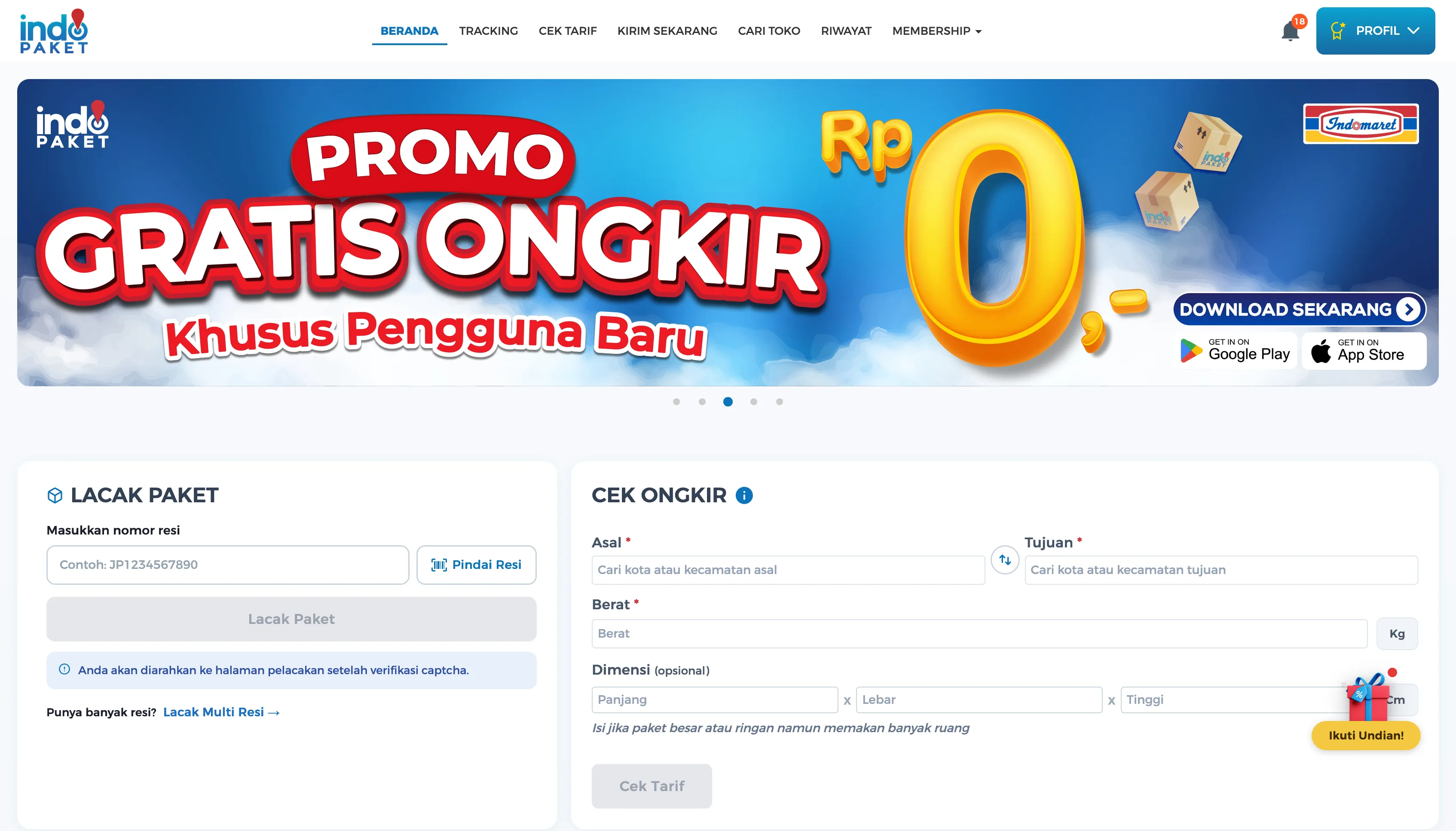
Surfaced tracking and rate-check as the homepage’s primary actions, instead of leaving them buried in plain, unlabeled fields.
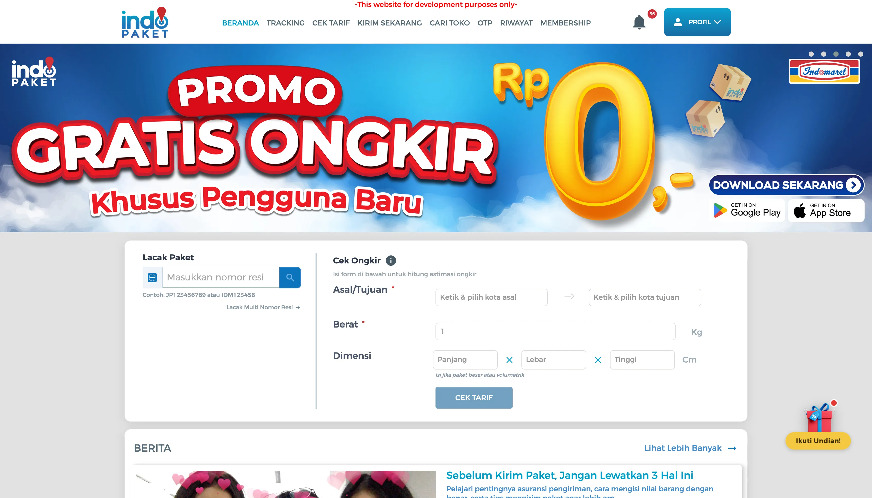
Hotjar showed the heaviest interaction concentrated on the “Lacak Paket” (track) and “Cek Ongkir” (check rate) widgets, both of which buried their primary action in plain, unlabeled fields — and the promo slider had no visible pagination. (Heuristic reference: Recognition Rather Than Recall.)
| Existing experience · Sep 2023 | Current iteration · 2026 |
|---|---|
 |
|
What changed
- Slider — added visible pagination dots and breathing room from the content below, instead of one static banner butting straight into the page
- Lacak Paket — added a “Pindai Resi” (scan) shortcut, a dedicated “Lacak Paket” button, and a note on what happens after submitting (captcha verification)
- Cek Ongkir — split the combined “Asal/Tujuan” field into two clearly labeled fields with a swap shortcut, and marked Dimensi as explicitly optional
Cari Toko (Store Locator)
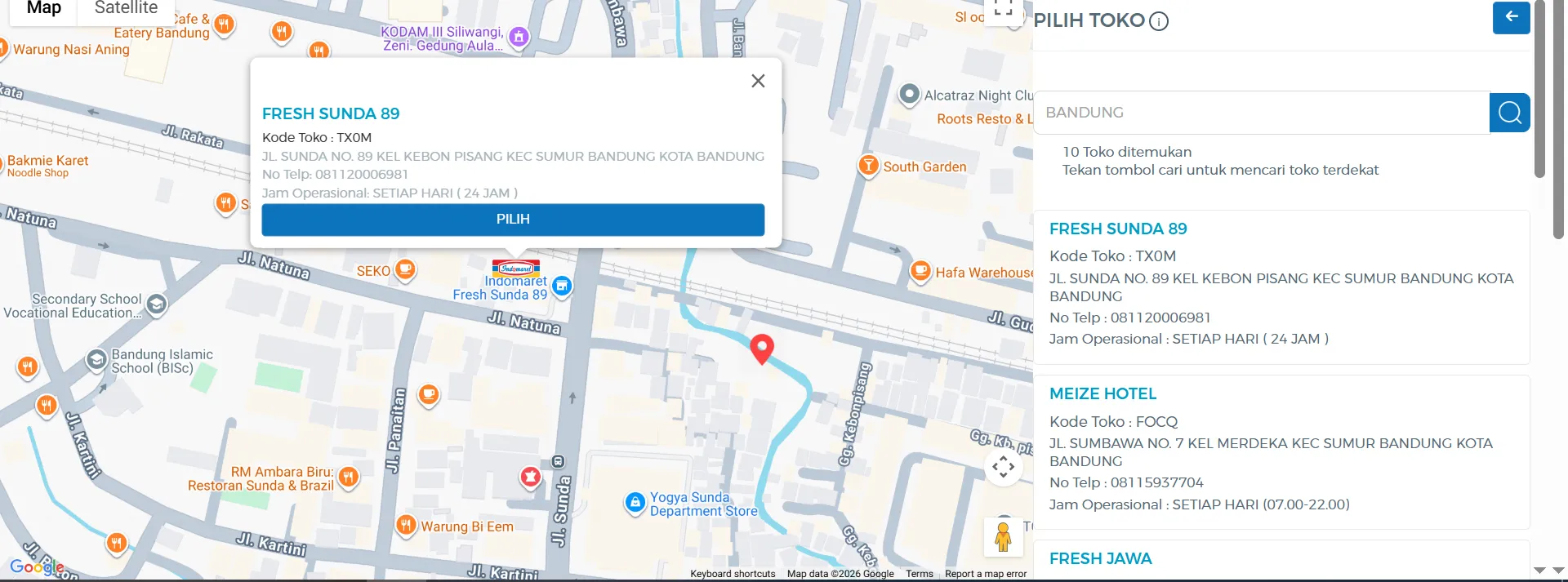
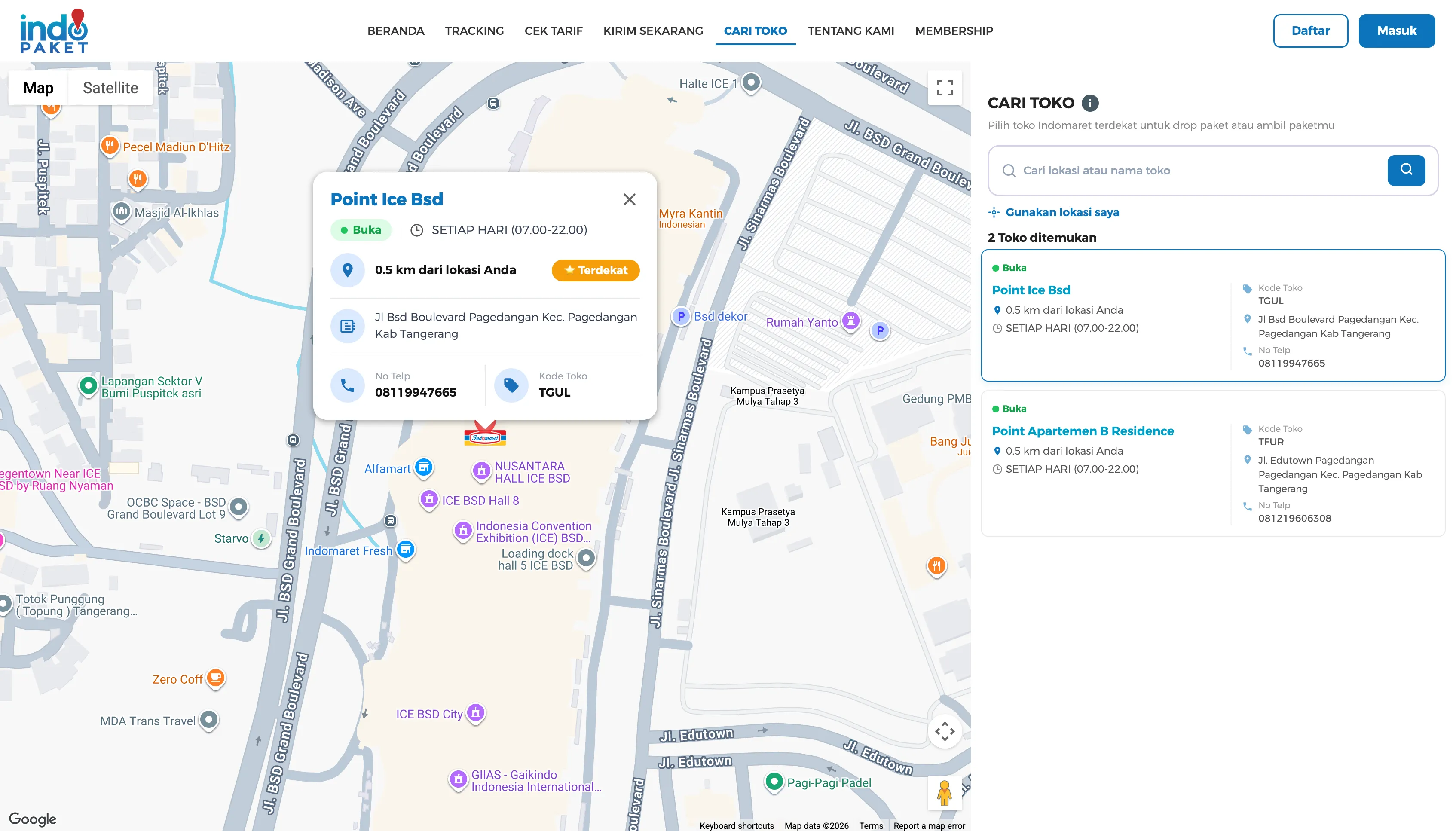
Shifted store details from a map-blocking popup to a compact card that keeps the map and result list in view.
Both versions kept a results list alongside the map. The problem was the selected-store popup: it was large enough to cover a significant part of the map, and closing it to check a different result meant losing sight of where the selected pin sat relative to the rest. (Heuristic reference: Visibility of System Status.)
Before — Existing experience · Sep 2023
After — Current iteration · 2026
What changed
- Selected store card — reduced in size and given a clear structure (status, distance, “Terdekat” badge, contact) so it obscures less of the map and surrounding results
- Result list — the selected store is highlighted in the list, keeping map pin and list entry connected instead of relying on the popup alone
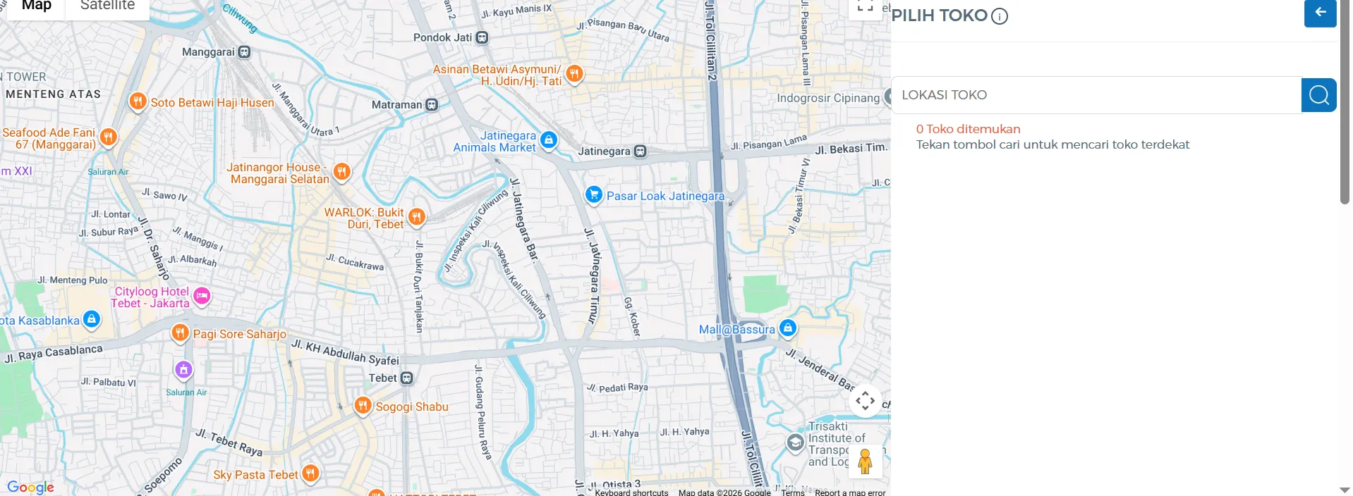
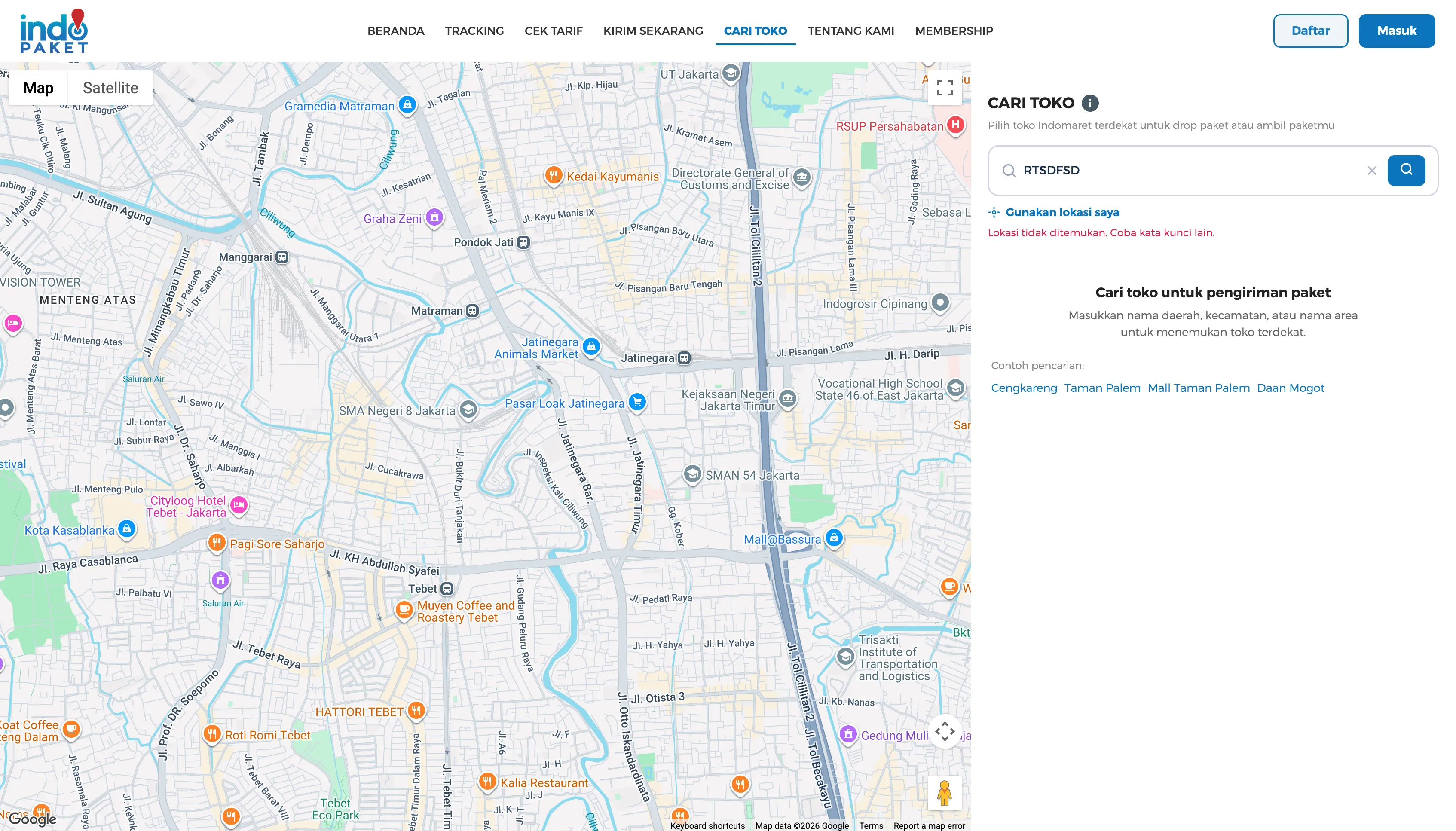
- No-results feedback — a plain “0 Toko ditemukan” became an inline, actionable “Lokasi tidak ditemukan. Coba kata kunci lain.”
| No results — Existing experience · Sep 2023 | No results — Current iteration · 2026 |
|---|---|
 |
 |
Kirim Sekarang (Ship Package)
Gave users stuck at the app-handoff screen an actual way forward, instead of a dead end.
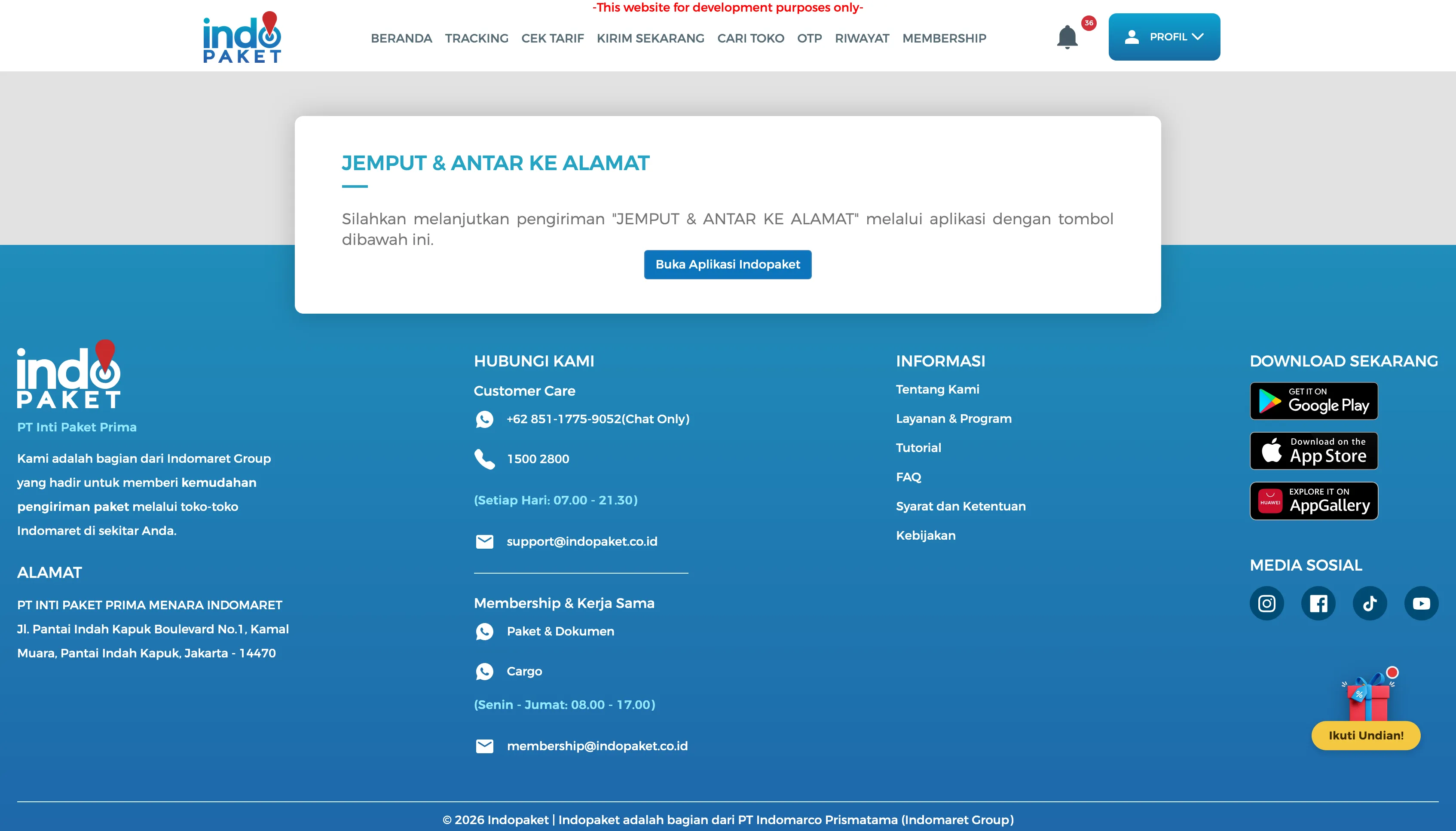
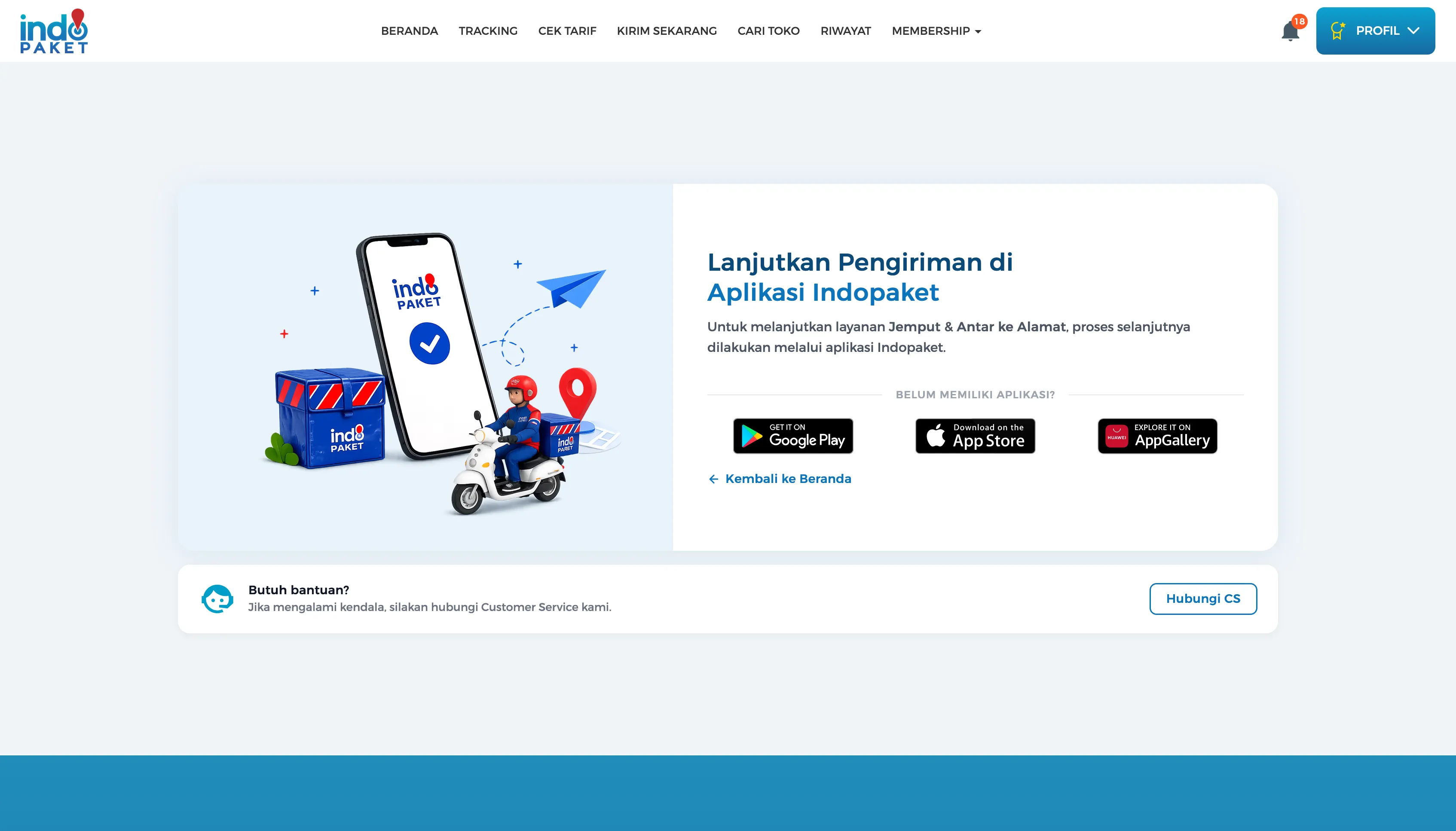
For “Jemput & Antar ke Alamat” deliveries, handing off to the mobile app used to be a bare card — one paragraph and a single button, with no fallback for users who didn’t have the app installed yet.
| Existing experience · Sep 2023 | Current iteration · 2026 |
|---|---|
 |
 |
What changed
- Added Google Play / App Store / AppGallery badges for users who don’t have the app yet, instead of dead-ending on a single “open the app” button
- Added a “Butuh bantuan? Hubungi CS” fallback card for users who get stuck mid-handoff
- Replaced the bare text card with an illustration consistent with the rest of the site’s redesigned states
Riwayat & Tracking
Turned a broken-image dead end into a self-diagnosis state users can act on.
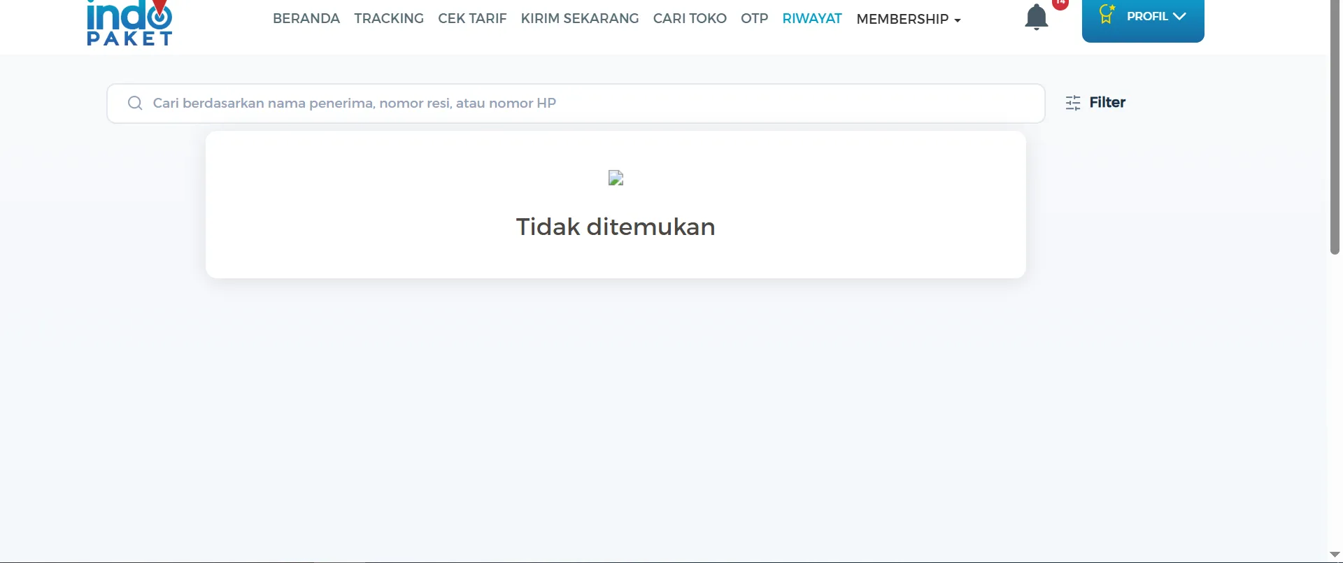
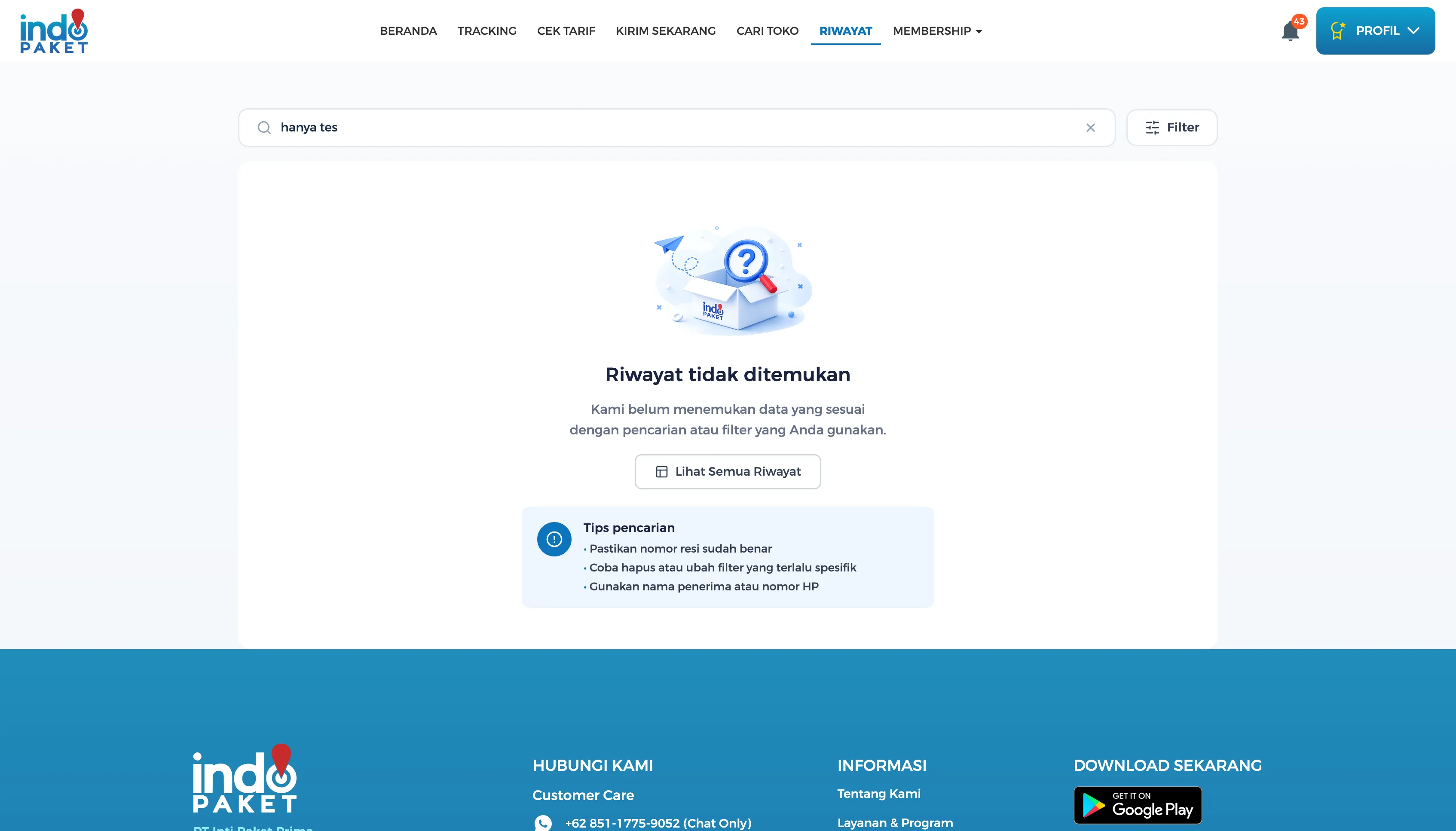
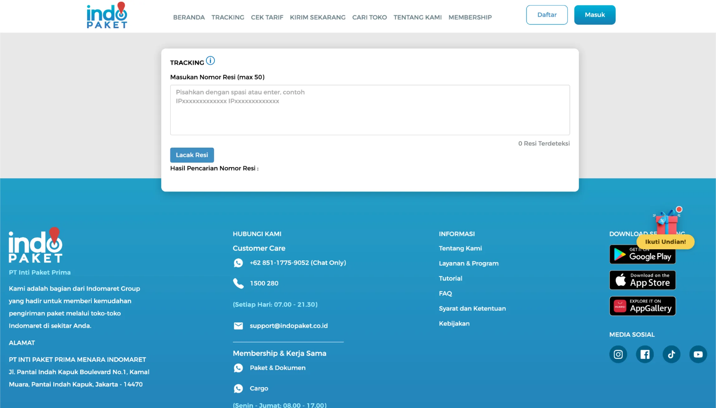
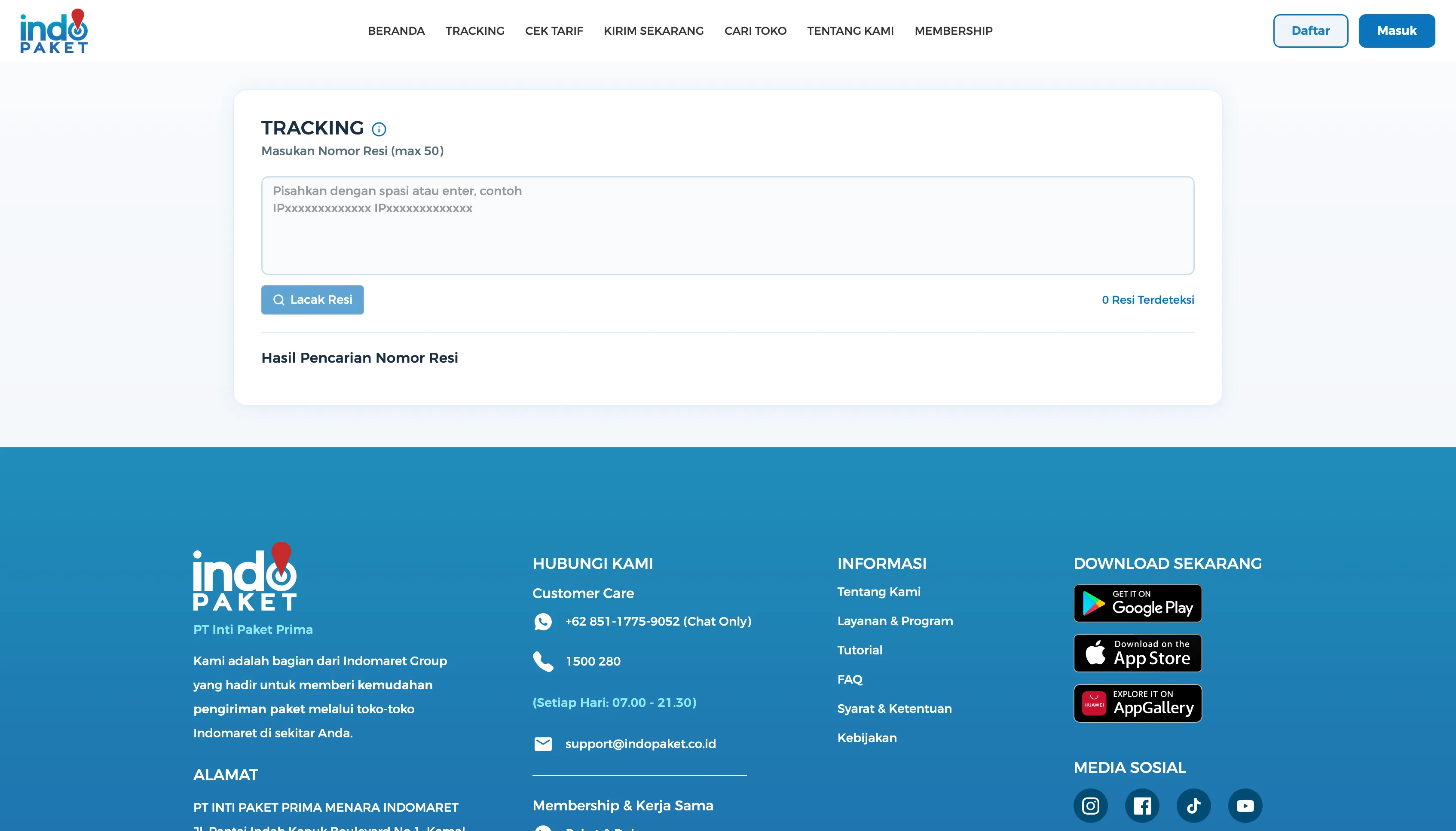
The old “not found” state on Riwayat (History) was a bare “Tidak ditemukan” message with a broken image and no guidance. (Heuristic reference: Help Users Recognize, Diagnose, and Recover from Errors.) The old multi-resi tracking input also drew scattered heatmap clicks with no clear pattern — a sign users weren’t sure how single-resi tracking differed from tracking multiple resi at once.
| Existing experience · Sep 2023 | Current iteration · 2026 |
|---|---|
 |
 |
 |
 |
What changed
- Riwayat’s broken-image dead end became an illustration + headline + self-diagnosis checklist — the same pattern now backs the Tracking page’s resi-not-found result too, so error states feel consistent instead of one-off
- Tracking input got a visual refresh, though the underlying single vs. multi-resi ambiguity is still an open item for a follow-up iteration, not solved here (see Constraints & Trade-offs)
Account and Authentication
How a new user registers and verifies their account.
Login and Register
Split a screen where two flows competed for attention into two focused, single-purpose ones.
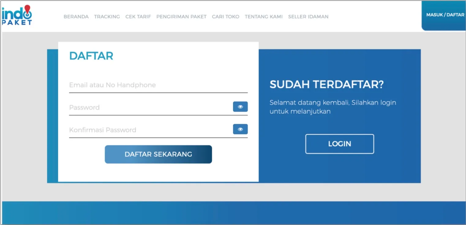
| Daftar (Register) — Existing experience · Sep 2023 | Daftar (Register) — Current iteration · 2026 |
|---|---|
 |
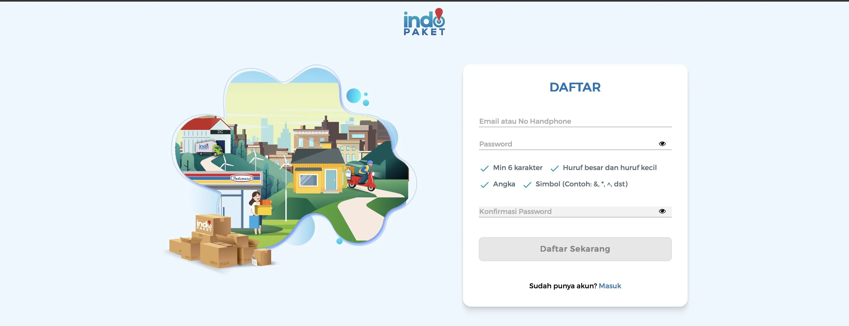 |
The registration form and the “Sudah Terdaftar? Login” panel used to compete on one screen — heatmap data showed clicks scattered across both. Login and Register are now distinct, focused pages instead of one competing screen. (Heuristic reference: Aesthetic and Minimalist Design.)
OTP Verification
Replaced a bare countdown with confirmation of what’s happening and what to do if it doesn’t.
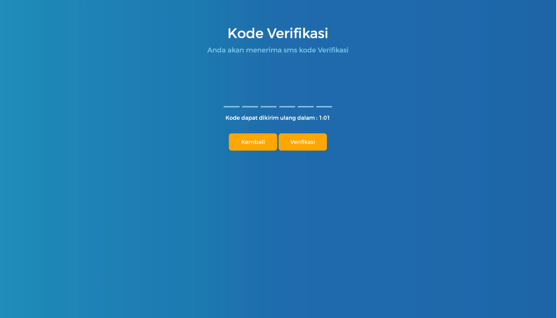
| Kode Verifikasi (OTP) — Existing experience · Sep 2023 | Kode Verifikasi (OTP) — Current iteration · 2026 |
|---|---|
 |
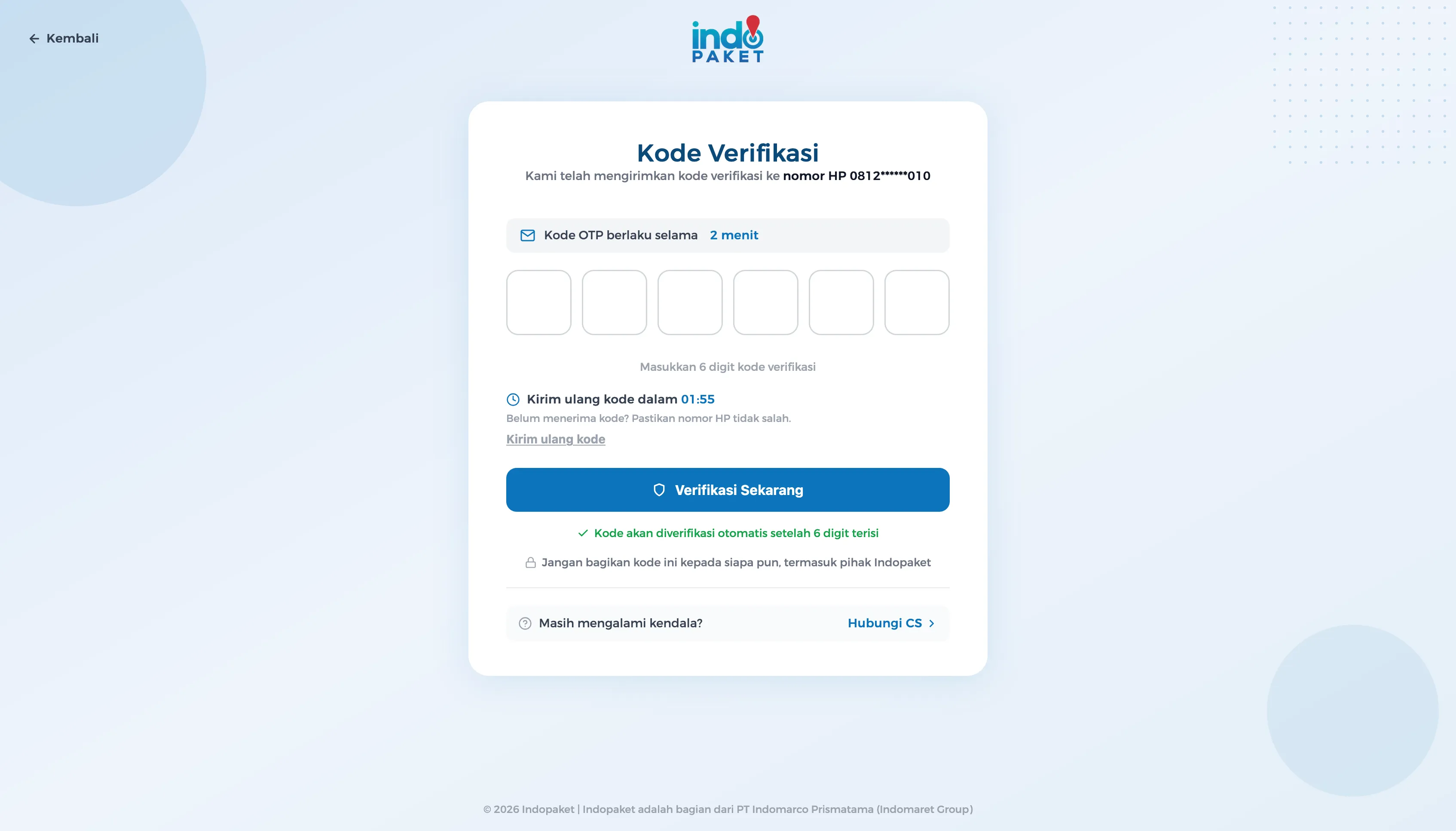 |
The old screen only showed a countdown and a bare set of input boxes — no confirmation of which number the code went to, no reassurance about what to do if it didn’t arrive. The redesign shows the masked destination number (“nomor HP 0812******010”), how long the code is valid, what to do if it hasn’t arrived, and a reminder not to share the code with anyone, including Indopaket staff. (Heuristic reference: Recognition Rather Than Recall.)
My Contribution
I owned: UX analysis (heatmap review, heuristic evaluation) · information architecture · interaction design across 9 core flows · frontend implementation (Laravel/Blade) · design-to-code translation
Collaborated with: Product team · Backend engineers (API contracts and business rules) · Business stakeholders (operational and referral logic)
Design → Engineering
UX problem — A shipping platform grown feature-by-feature, with fragmented navigation, ambiguous form fields, and error/empty states that dead-ended users.
Design decision — Restructured navigation around user tasks (track, check rate, find a store, ship) instead of internal product categories. Standardized empty and error state patterns so they felt consistent across journeys, not one-off.
Engineering constraint — Existing Laravel/Blade frontend — no rebuild, no new framework. The redesign had to work within existing component patterns and backend contracts owned by other teams.
Implementation — Translated interaction decisions directly into production Blade templates styled with Tailwind CSS. Built reusable empty-state components, store-selection card, and form layouts the team can extend.
Production — Shipped across 9 core flows on the live Indopaket web platform.
Design Decisions
- Clarified the single vs. multi-resi tracking entry points instead of one ambiguous field
- Separated Login and Register into distinct, focused flows instead of one competing screen
- Redesigned empty/error states to guide users toward a next action instead of leaving them stuck
- Standardized recurring UI patterns (status indicators, cards, tables) across sections that had previously diverged
Implementation
Shipped within the existing Laravel frontend, not rebuilt from scratch. The redesign wasn’t handed off as static screens. Built with Laravel Blade and styled with Tailwind CSS, I translated the interaction model directly into production templates — working within existing component patterns, backend contracts, and business rules — focused on shipping something maintainable by the rest of the team going forward, not just a one-off visual pass.
Next iteration: the platform is planned to be rewritten in React/Next.js, which will consolidate the patterns introduced during this redesign into a more reusable frontend architecture.
My role across this project: UX analysis (heuristic evaluation, heatmap review) · information architecture · interaction design · frontend implementation (Laravel/Blade) · design-to-code translation.
Impact
Product — Consolidated a feature-by-feature web platform into a more coherent, task-oriented experience across 9 core flows, without disrupting the operational and referral logic other teams depend on.
UX — Removed extraneous cognitive load (duplicated fields, unlabeled inputs, oversized popups) while leaving the domain’s inherent complexity intact and legible.
Engineering — Delivered the redesign as production Laravel/Blade code with reusable patterns (empty/error states, cards, status indicators) the team can extend, rather than a design handoff that stops at Figma.
For sellers and internal teams — Login/Register no longer compete for attention on one screen, store selection no longer loses the user’s place behind a popup, and the app-handoff and OTP flows leave people with a clear next step instead of a dead end.
Outcome
Before: A feature-by-feature platform where navigation was organized around internal categories, primary actions (track, check rate) were buried in unlabeled fields, store selection covered the map with a large popup, and error/empty states dead-ended users with no recovery path.
After: A task-oriented web platform where sellers and internal teams can complete their core journeys without reorienting. Navigation reflects what users actually do. Empty and error states guide instead of dead-ending. The app-handoff flow gives stuck users a clear next step. Login and Register no longer compete on the same screen.
Shipped as production Laravel/Blade code with reusable patterns the team can extend — not a Figma handoff that stops at design.
Some friction points, like the single vs. multi-resi tracking ambiguity, were intentionally deferred to a follow-up iteration rather than rushed into this pass.
Related Skills:
Technologies Used
UX Analysis
Frontend Implementation
Product & Collaboration
Portfolio of

Riani BM
UX Engineer
from Indonesia